Tuesday, September 24, 2013

Visual Journal Assignment #5


Due: Monday, September 30th
 
Doodle drawing by Kerby Rosanes
A doodle is an unfocused or unconscious drawing made while a person's attention is otherwise occupied. Doodles are simple drawings that can have concrete representational meaning or may just be abstract shapes.

According to a study published in the scientific journal Applied Cognitive Psychology, doodling can aid a person's memory by expending just enough energy to keep one from daydreaming, which demands a lot of the brain's processing power, as well as from not paying attention

Some artists have even made doodling their style of choice. Artists like Kerby Rosanes have created incredible pieces of artwork in the “doodle” style.

For this visual journal assignment, you will be creating an 8 inch by 8 inch square in your sketchbooks (or on a sheet of drawing) paper. You will fill this entire square in with doodles. Your doodle should take up the entire square, with the images overlapping one another to leave very little empty space.

Your doodle can be drawings of actual things or more abstract. It can be made up entirely of images, or incorporate text as well.

For your paragraph, you will write about the experience you had creating your doodle. Did you find the process enjoyable or difficult? What were you doing while you were doodling? What were you thinking about while you were creating this doodling?

Make sure all of your doodles (images or text) are school appropriate.

Sunday, September 22, 2013

Drawing facial features

I'm beginning to think my college professor is a little clairvoyant. Last week she assigned us hands to draw (which my 6th graders are doing) and this week she assigned us facial features (which my 7th graders just wrapped up).

I love to draw portraits, so I'm finding this week's homework really enjoyable. There's something completely fascinating about looking closely at an eye or a nose or a mouth. There's all these subtle details you don't even notice until you really take the time to study them in depth.

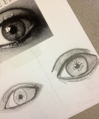
For my grad school homework, I have to draw nine studies of facial features,enlarged (drawn bigger than real life). Our professor asked us to create the illusion of three dimensionality using value and cross contour lines.

So far my wonderful fiancé has allowed me to draw his eye and his nose. Two down, seven more to go!

A page from Miss Goff's sketchbook, showing her art homework

Friday, September 20, 2013

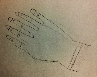
Drawing Hands

Miss Goff's hand drawings (much erasing and re-working were involved in the making of these hands)
Hands can be one of the most challenging things for a young artist to draw. These's a lot of different parts and subtle details to capture to make things look right. The 6th graders have been learning about observational drawing. At the beginning of the year, I had the students draw their own hand without any sort of instruction.

Today students worked with me and drew their hands while carefully observing the proportions. They paid attention to where things were located on the hand and how large or small things were in comparison to each other.

The students greatly improved on the overall structure and proportions of their hands. Below are just a handful of photos that show the progress the student's made. Great job, everyone!

Carly's 1st hand drawing
Carly's 2nd hand drawing


Pat's 1st hand

Pat's 2nd hand


Sarah's 2nd Hand


Sarah's 1st Hand


Jack's 1st hand

Jack's 2nd hand


Jeff's 1st hand

Jeff's 2nd hand


Thursday, September 19, 2013

8th Grade Pop Art!

For the past few weeks, the 8th graders have been learning about Pop Art. The students have looked at famous pieces of artwork by Andy Warhol and Roy Lichtenstein. They've analyzed what the common characteristics of Pop Art is and used those characteristics to create works of their own.

Student had to transform a well known piece of artwork into a piece of Pop Art by using bold, bright colors, black outlines and Ben-Day Dots.

Check out some of the great work the students are doing below!


Tuesday, September 17, 2013

Movie Poster Designs!

For last week's homework, students had to create their own version of a movie poster for their favorite film. Their posters had to reflect the overall feeling of the film and give the viewer a sneak peek at what the movie might be about.

I have to say I was super impressed with many of these designs! It was clear the students put in a lot of time and effort and came up with some pretty amazing posters.

Check out the ones below!

The Hunger Games poster by Danielle


Coraline poster by Jen


The Little Mermaid poster by Alexa


The Mighty Ducks III poster by Jack


The Amazing Spider Man poster by Tyler

Oblivion poster by Lyndon


The Sixth Sense poster by Tom
The Lord of the Rings poster by Tim
Megamind poster by Claire


Monday, September 16, 2013

Even teachers have homework...

I've mentioned to some classes that I'm currently going to school myself. I'm working on obtaining my masters degree in Art Education from Framingham State University. I take a life drawing class every Wednesday night and yes, even I get homework.

This week we were asked to draw hands...lots and lots of hands. My homework requires me to draw 5 hands from Master artists drawings (artists like Da Vinici and Michelangelo) as well as 4 observational drawings of my own hands.

So anytime you feel bummed about the homework  you have, just know that I'm at home as well, doing my homework :-)
Miss Goff's sketchbook, filled with hands (and a portrait in progress)

Visual Journal Assignment #4

Due: Monday, September 23rd 
An idiom is a combination of words that has a figurative meaning due to its common usage. An idiom's figurative meaning is separate from the actual meaning or definition of the words of which it is made of.

The idiom "a horse of a different color" has nothing to do with an actual horse. Instead it refers to a situation or a subject that is different from what you had first thought it was. 

Another common idiom is "it's raining like cats and dogs". The saying refers to a very loud and noisy rainstorm.

For this visual journal assignment, you are gong to be creating an illustration of an idiom of you choice. For example, if you chose "it's raining like cats and dogs" you would draw a picture of cats and dogs raining down from the sky.

For your written element, you will write down what idiom you chose and then describe what the figurative meaning of it is. For example, if you chose "a piece of cake" as your idiom, you would draw an actual piece of cake, but then describe to me in your writing that the term is used to describe something that is overly simple or easy. Like, "That test was a piece of cake".

Check out the site www.idiomsite.com if you need help thinking of an idiom to use.


Miss Goff's idiom illustration of "The Last Straw". The idiom refers to something that finally brought someone to the point of losing their temper.

Wednesday, September 11, 2013

Observational Drawing

The 6th graders are hard at work learning how to draw what they see. We've been working on various drawing exercises that make students really look at what they're drawing and translate that on paper.

This week students have been working on doing observational drawings of their shoes. Check out the photos below of students hard at work.


Tuesday, September 10, 2013

Postcard Designs

Last week for homework, students had to create a postcard from a destination of their choice. It could be from a location they'd been to before, or some place they'd like to go to in the future.

These postcards from Claire and Ben were awesome! Claire drew a postcard depicting Gallifrey, the home planet of Dr. Who while Ben chose to keep things earthbound with Japan.

Gallifrey postcard by Claire

Japan postcard by Ben
 Nice work, guys!

Monday, September 9, 2013

7th grade artwork!

Even Miss Goff practices her portrait drawing
The 7th graders are currently working on portraiture. To get ready to tackle the challenging task of drawing faces, they're practicing drawing each of the major facial features individually. This week we've been working on eyes. Here are some really great eye drawings by some of the 7th graders.
Eye drawing by Ally

Eye Drawing by Sam

Eye drawing by Audrey

Eye drawing by Christine

Eye drawing by Jake

Eye drawing by Jared

Eye drawing by Johnny


Eye drawing by Rachel

Visual Journal Assignment #3

Due: Monday, September 19th


For this visual journal assignment, you are going to be designing a movie poster for your favorite film.
Movie posters are a way to advertise a film and to give audiences a sneak peak at what a movie may look like.

In your movie poster, you should include the following:
  • The name of your film written in an interesting way that goes along with the feel of the movie
  • Images that go along with the film
This should be your original take on a movie poster. You should not copy a preexisting movie poster.

Also, your movie poster needs to be school appropriate. Please do not choose any R-Rated movies or movies that are violent or gory. 

For your paragraph, please explain to me why you chose the movie that you did and how you feel like your poster is a good representation of the film.


Miss Goff's poster design for "My Neighbor Totoro"


Tuesday, September 3, 2013

Student Artwork

As I said in my first post, I plan on using this blog to showcase student artwork from the school year. Today I'd like to feature a student who blew me away with her homework assignment for this week.

Hannah wowed me with her M.C. Escher inspired skateboard deck design. Keep up the good work, Hannah!

Skateboard deck design by Hannah. Pencil on Paper.

Visual Journal Assignment #2


Due: Monday, September 9th

For this visual journal assignment, you will be designing a post card from a destination of your choice. Postcards usually feature landmarks from the location or images of things the location is well known for.


Your postcard design destination can be somewhere you’ve been in the past or it may be a location you’d like to visit in the future.

 For the postcard design, you need to include the following:


*  Visual elements that come from the destination you’ve chosen. For example you may wish to include Big Ben if you’ve chosen London or the Coliseum if you’ve chosen Rome. You could also include geographical landmarks like Mt. Fuji for Japan or a tropical beach for Jamaica


* The name of your destination written in interesting writing


For your paragraph, you will write to a friend/family member about what you’ve done or would like to do in your destination of choice. For example, if you chose Hawaii, you could talk about how you went to the beach or how you visited lava flows.
Miss Goff's postcard design

Miss Goff's paragraph describing what Rio would be like